

CREATIVE DIRECTION / BRANDWORLD / PACKAGING
Background
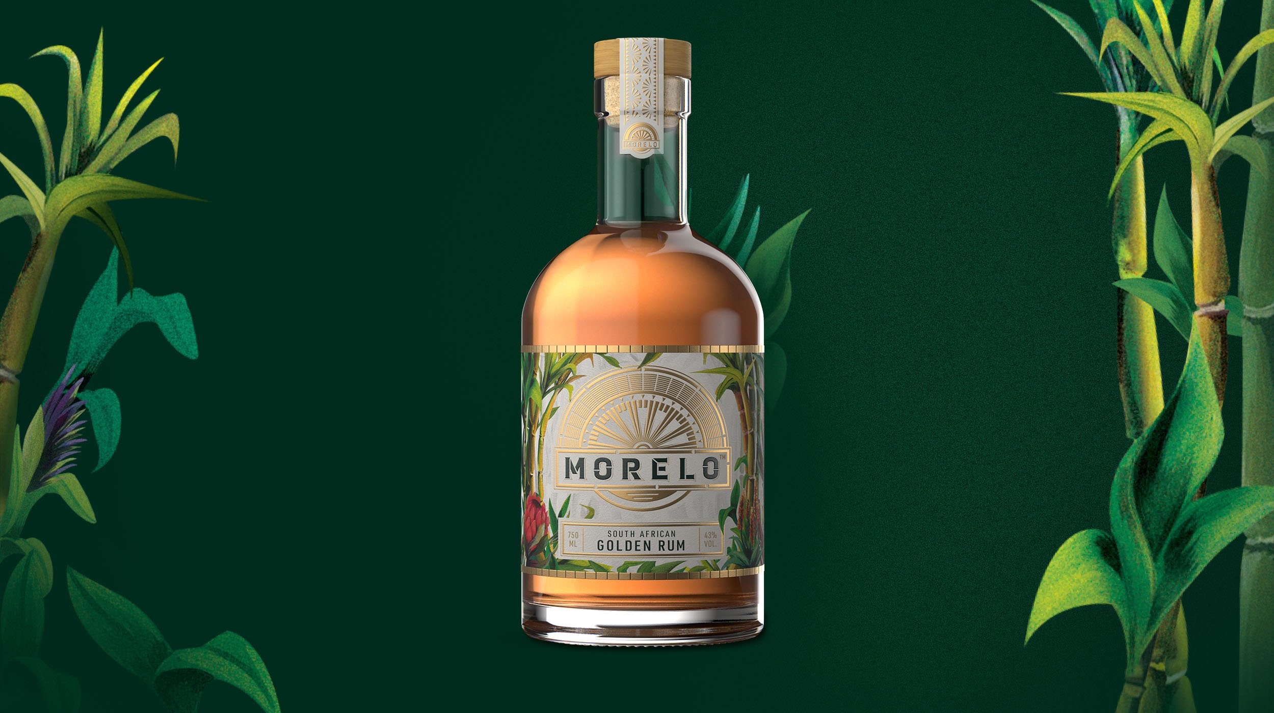
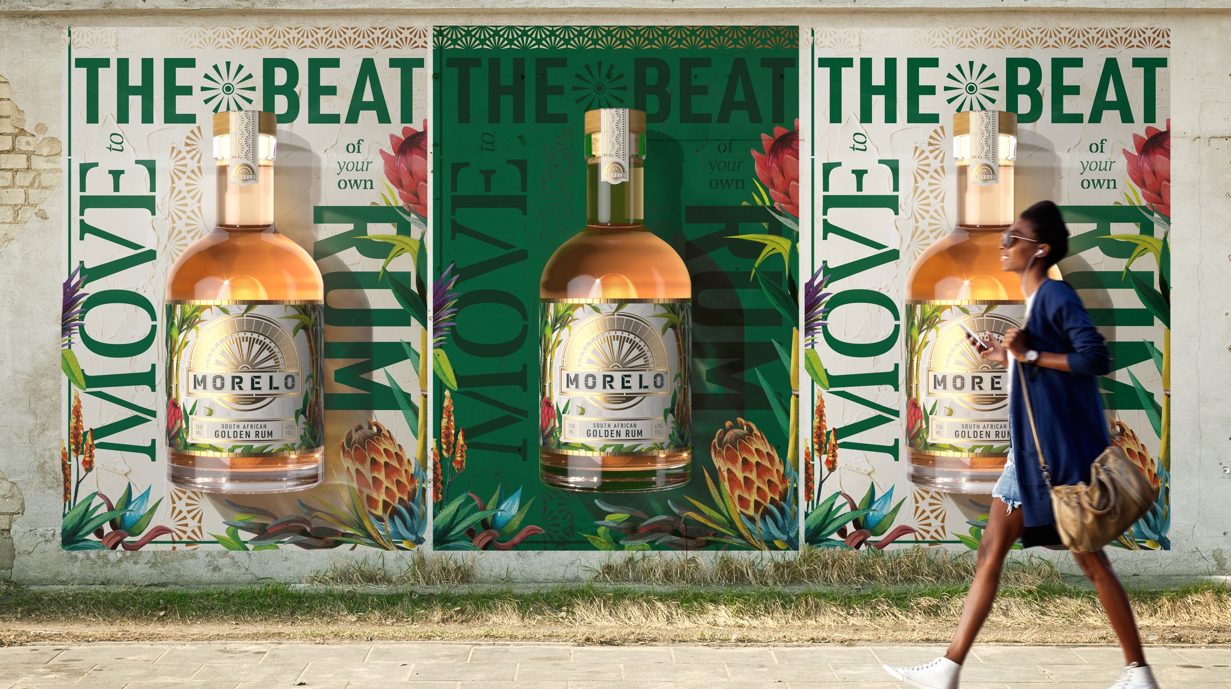
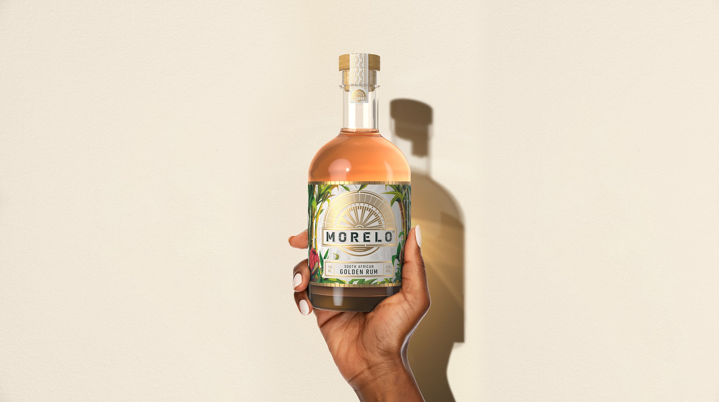
Diageo identified an opportunity for a new approach to brown spirits in South Africa. The opportunity would address a growing craft scene, be authentic and stand for empowerment in a way that is meaningful and progressive to a new generation of consumers:
To make our dreams a reality, my generation have to play by our own rules.
We embrace the extraordinary, the unexpected.
Because if we don’t, nothing will change.
So we do things our own way, we lead change,
and we do it with joy and pride.
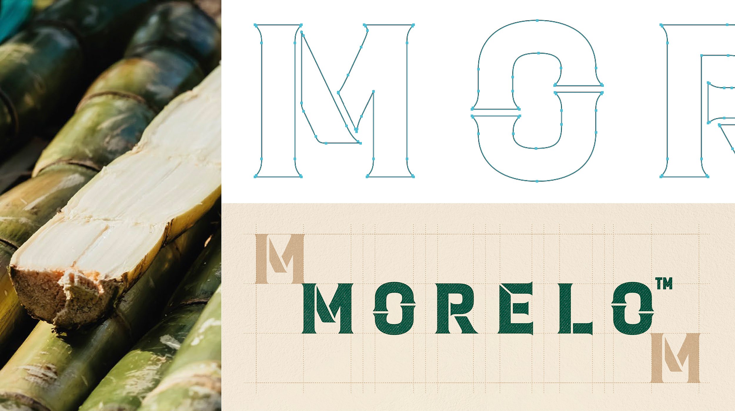
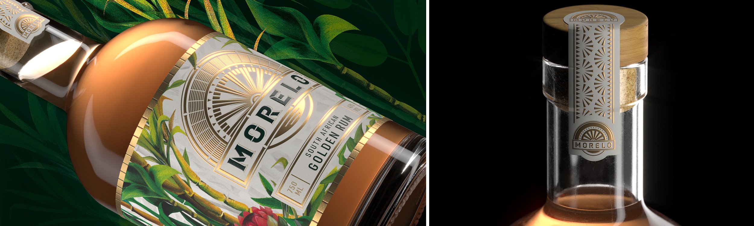
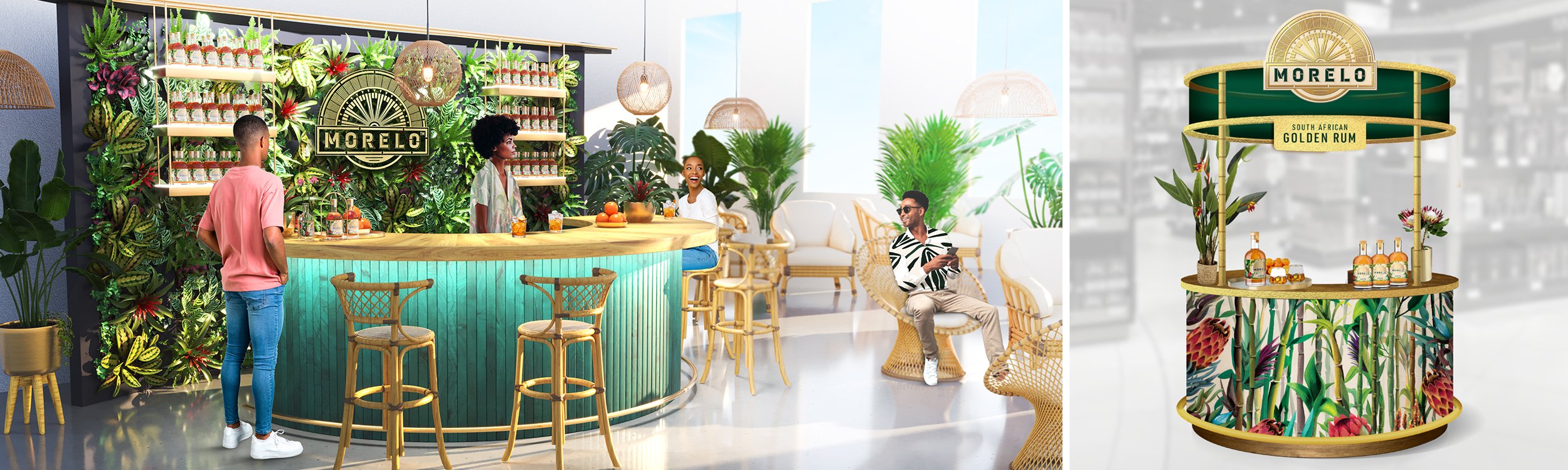
Whilst working alongside a very talented design team at Marks, I helped with Creative Direction on each asset and activation piece for the Morelo brand book. The outcome being, a carefully crafted brand with immense depth and done with an authentically South African style that is right for the market, breaking category boundaries and expectations. Morelo opens up a new and unexpected drinking experience which speaks directly to a generation of consumers who make their own rules and are proud to do things differently.